
Lately, while commenting on images in various groups, two interrelated concepts have come up: iRay's desire for light to render 'noiseless' images and the idea of a 'dark' render. Let's tackle that first one.
iRay is a photoreal render engine. It functions, in physics terms, as a camera. A camera, in the physical world, needs light in order to produce an image. There's no getting around this: it's the way the engine works, and it does a very good job of simulating the physics of real world light.
You, as the artist, have various methods for telling the render engine how to manipulate the light in your scene. I'm not going to cover the first two here, but they are essential for you to at least the learn the basics of: actual lights in your scene (not going to get into the argument over emissive surfaces vs. 'lights'; I use them both, though I lean towards emissive lights for effect and ambience rather than the main suppliers of light in my scenes) and the Environment settings where you use an HDRI to provide light. As an artist, you need to conquer these tools and figure out how to use them to your best advantage to get the result you are looking for.
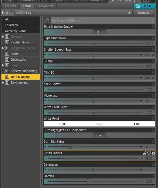 The next item on the list is Tone Mapping (see the illustration to the left). There are two approaches to Tone Mapping, and I've used both of them in the images that accompany this article. The first approach is to do your Tone Mapping in render by using the Tone Mapping tab of the iRay Render engine. This gives you control over the camera itself (I'm sorry, yes you are going to have learn at least a little bit about how a camera works if you want to master these settings) along with some more arcane 'film tricks' like White Point Scale and White Point (these allow you to alter the color of your entire image, pushing it towards blue or red). And you have further settings to control the brightness of highlights and the darkness of shadows and a further color manipulation tool in Saturation (please don't mess with the Gamma unless you know exactly what you are doing, there is a reason that Gamma defaults to 2.2 and if you don't know what you are doing, its best to leave it at the default).
I covered some of the basics of Tone Mapping in render in this article here (I know the formatting is bad, I'm going to update that).
Two things about Tone Mapping in render: it does NOT, allow me to repeat that, does NOT introduce 'film grain' at higher ISO or film speed. This is one of the areas where iRay does not mimic the real world. This is a limitation of real world film cameras and not a feature. As a digital artist you have the option of introducing these artifacts yourself in post work (oh NO! Not post work!). And, yes, unfortunately, Tone Mapping in render is going to increase your render times because it adds calculations. This is unavoidable, but worth the extra cycles in the render process.
The second method for Tone Mapping is to do it in post (say it with me: 'oh No, not post work!'). Doing your Tone Mapping in post (via Adobe PhotoShop or similar) is my preferred method because it gives me greater creative control over individual light sources along with overall the control that using the Tone Mapping settings of the engine does.
Yes this method does require you to render to Canvasses and to spend a little time and effort creating the different layers before you render and then composite them afterwards. It's probably more time consuming in the end than doing the Tone Mapping in render, but I feel its worth the time spent.
Okay, enough of all that. Lets talk about the title: Dark is not the absence of light. Well, of course it is. Until you start talking about art (yeah, yeah, you might not want to call it art because of whatever your biases are, but we're going to use the term).
When you start talking about dark in art, it can not be the absence of light because with out light you can not see! If you can't see it, how bloody ineffective is the art going to be? A better term than dark is perhaps: 'moody' or even 'dramatic'. What you are saying when you say 'a dark render' is that you want tension, you want drama. In order to have these things you need contrast, you need dynamic interplay of light and shadow. Above all the viewer has to be able to see what you are drawing attention to, and that means you are going to have to light your render.
There are two beginner mistakes that anyone has to conquer: too much light and not enough light. Too much light leads to a render that is flat and uninteresting, with everything bathed in even, boring tones. Too little light and you have can't see all the details that your pored over while creating the image and where's the fun in that? You slaved over setting up your digital diorama for hours, didn't you? You want people to see it!
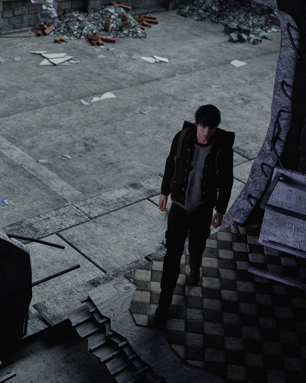
To the right here is the second image I rendered to illustrate this article (my computer was down for almost two weeks, so I've been at this a while).
I used only two light sources for this image (I actually rendered out three but ditched one in the post work phase): one is an environment light that provides the majority of what you see and gives us the dramatic (I hope) transition from light into shadow where are our character is moving.
You can barely tell that the second light is there, but it is. Its a single spotlight aimed at the character's face to give us just a hint of his left side and to give him just a touch more shape and dimension. You can just make out the highlights on his left cheekbone.
This image is heavily post worked. I did not use the Tone Mapping in render, in fact I turned it off completely (unless you are going to use a tone mapped render as one of the layers in your composite, the best thing you can do is to turn off tone mapping completely for this method as those are cycles that can be better used elsewhere).
I rendered four passes: one each for the two spot lights (one of which I ended up ditching), one for the environment light and one 'beauty' pass that combines all the lights into a single layer like a traditional render. I often use this beauty pass in my composites, but I did not this time as I ended up ditching one of the lights I had set up so it didn't really match with the others.
The lower right corner is completely black. While that goes against the stated aim here, it was done purposefully and I had to work to get it, there is a filter applied here to add a slight vignette effect the whole image and that is what finally pushed that corner down into complete darkness.
But that's symbolic and a specific choice. You can see a wide variety of the detailed Stonemason prop I used (City Ruins 1 and City Ruins 4, in case you were wondering, but the final camera I decided on kind of erases CR 4) along with my character (my OC and favorite James, who is a combination of Michael 6 and other morphs) and his clothes (the fantastic Horror Survivors: Marius, by the oh-so-talented Luthbel),
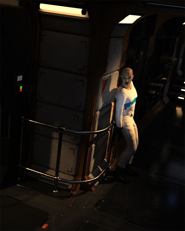
And now we have the first piece, that heads this article, which is a very complex lighting example spurred by one of the images that started me off thinking about this article.
I needed some emissive surface lights, so I went with Stonemason again (Section 4 with the Section 6 textures). There is no environment light here as the prop is completely enclosed (though I did open a door to the left of the image and shine a spotlight through it) so the Environment tab is set to Scene Only. The majority of the ambient light in the scene is produced by the emissive surfaces (light sources) you can see. This produced a wonderfully dramatic set after a bit of Tone Mapping help ( I altered the White Balance and Crush Blacks using presets from DimensionTheory's tonally fantastic Tonal Rage; if you are doing Tone Mapping in render, you NEED this collection of presets, it will make your life infintely easier).
What the emissive surfaces did not provide me with was a well lit character, and my space vampire here needed to be seen. So there are three spotlights aimed at him: One from the back so he stands out from the shadows behind him, one from above and behind to give my my overall illumination and some great highlights and then one tightly controlled spot aime at his face from the front and below to give me the highlight and underlighting that really makes his face stand out from the shadows cast by the main light.
If you want to see either of these images in their full resolution, head over to my Gods and Monsters gallery.
I hope you found this educational or at least interesting, Feel free to post a comment. If you want to see more of this type of thing, be sure to let me know. If you think its worth paying a little to see more of this sort of thing, be sure to let me know because I am kicking around the idea of starting up with Patreon.