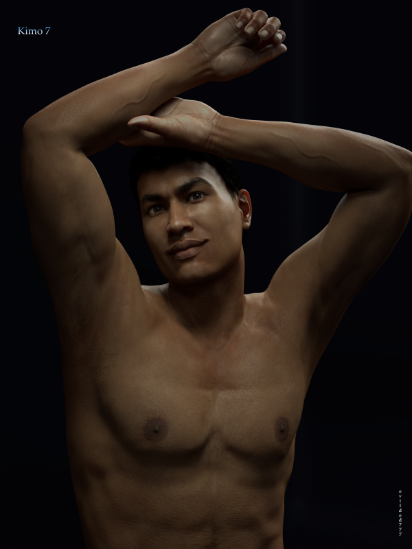
Taller than Mike, but shorter than anyone else and brawnier than the lot..."part man, part myth", Daz3D brings you Kimo 7, the latest character shape for the Genesis 3 Male line of figures.
Well, I have to applaud the latest bout of genetic diversity for the Genesis 3 Male line. I'm disappointed that the offical party line is that male teens/boys "don't sell", and that we will not be seeing an official Geneis 3 Male teen or boy (for now there is Growing Up for Genesis 3 Male and Chase -- which requires the Growing Up product; Growing Up is awesome, the best set of morphs yet; I can't recommend Chase as I don't own it), but it is great to see a new genotype. And I'd say he's more than just arm candy for the female version.
Kimo 7 is instantly recognizable as a Pacific Islander of some descent, exactly from where is questionable, but I don't think that question really needs an answer. This is not a character I would have thought to make for myself, but I can see myself slipping him into almost any type of render as a main character or in a support role. Three cheers for diversity.
The textures are the standard of quality that one would expect, except that I see quite a bit more specular in the diffuse maps that I would normally. Going back over the character releases, I see the same sort of specular in Lee, but much less in Gianni, Michael or Leo. I don't think it detracts enormously, but it is a little troubling to see. I know its impossible to completely remove all the evidence of flash photography from the textures, but I really do expect a little bit better of an attempt than what I see here: across the nose, the eyelids and the forehead there are glaring flashes of reflection and these are carried over into the specular maps and the bump maps. As we know, iRay is very good at pointing out the little flaws. This may make a difference.
Other than the aforementioned specular issues, the textures are very good. I still don't believe that the veins painted into the translucency map actually do anything. And it seems that the translucency map ought to actually at least hint at the areas that ought to be more or less translucent, and I am not sure they do that. Sure, the ears sometimes seem lighter... but the nose ought to be darker and its usually not. Effects maps like translucency ought to help out where the underlying model can not accurately re-create reality, and this they do not always do.
It is my opinion that the default materials, or the "official" materials are getting worse not better. The cornea always has a texture map applied. Why? The cornea is a clear, refracting surface. Why in the world does it need a diffuse map and translucency? These are supposed to be materials set up for a physically based render engine and we are ignoring the fundamentals of PBR. Please, at the very least, Daz, stop doing this!
The eyes are the worst part. I don't know where they come up with these settings, but they seem nonsensical to me. Transmitted Measurement Depth of 100? One hundred what? I'm pretty sure the measurement is in centimeters... so does that make any sense? And what's with that orange-brown transmitted color on both the iris and the sclera? I don't get it.
Somewhere along the line, after Guy 7 who had a much more reasonable Transmitted Color for his skin surfaces, we switched to a blue transmitted color. Why blue? Can someone explain that to me? Because from everything I've learned regarding this function in iRay, blue doesn't make any sense.
But I will let you be the judge, because it is always in the eye of the beholder. Here's Kimo with his "official" materials, in exactly the same render as my article lead (they were tone mapped seperately so they are not exactly the same). I leave it to you to decide if the "official" materials need some work or not. Looking at it now, my intro image could be a little brighter, but I think the skin looks more natural without the odd red highlights.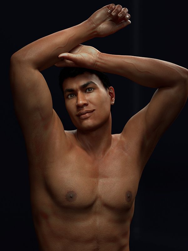
I've been a frequent reader and contributer to this thread: Fiddling with iRay Skin Settings, and it really has some of the best information available by some of the brightest minds on the forums. I recommend it, if you are not happy with "official" materials or materials from a vendor.
Ok, climbing down off my soapbox now. Sorry that was a little ranty, but I am leaving it in. The default materials render reasonably well. I think they could be better, and I think some parts of them are just plain wrong from a PBR perspective. But... that's my opinion, and we all have our own.
Kimo does have a great shape. His default shape is, I think, instantly recognizable. Or at least recoginzable as the image we have come to associate with Pacific Islander males. The facial features and the physical dimensions all seem very appropriate.
I'm not a fan of some of the veins. the nearly identical forearm veins in particular. There's just something contrived about those, while others seem more natural.
All in all, I'm really pleased with Kimo 7 and I think you will be too.